The dynamic terminal: Meteora's UI evolution for LPs.
Meteora's new DLMM UI is live: fullscreen three-column layout, bin-step switcher, one-click close and deeper pool data. What changed for LPs.
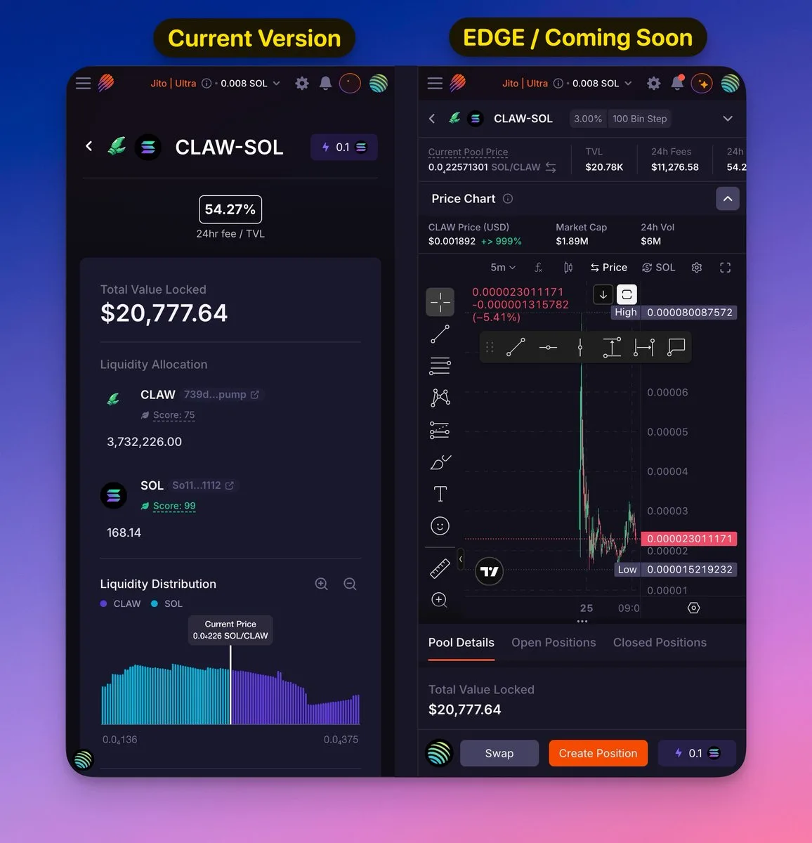
The wait is finally over. The new @MeteoraAG UI that we've been testing on EDGE is now live on the stable app. This is more than a new coat of paint. It is a whole new way of doing things, built for speed and accuracy.
These changes are going to change how you handle your liquidity if you really want to LP. This is my list of what's new or changed.
The new workspace
Fullscreen Design: Meteora changed the layout to three columns that go all the way to the edges. This gets rid of wasted space and lets you see all the data you need in one place.
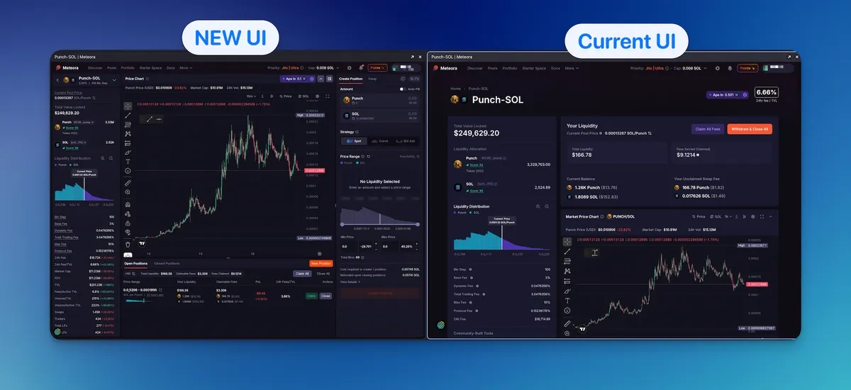
The UI is now modular and can be changed. You can make sections like the price chart or side panels smaller or bigger to focus only on the parts that are important to your strategy. You can resize or hide each of the panels separately.
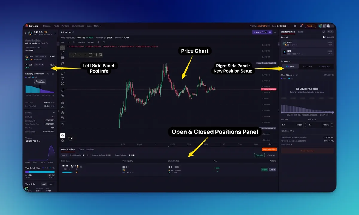
Sidebar Position View: clicking on any of your active positions now opens a smooth slide-out panel that lets you see claimed fees and manage liquidity right away, without leaving the main screen. Add liquidity, Rebalance or Withdraw liquidity is also available in this view.
Speed and execution
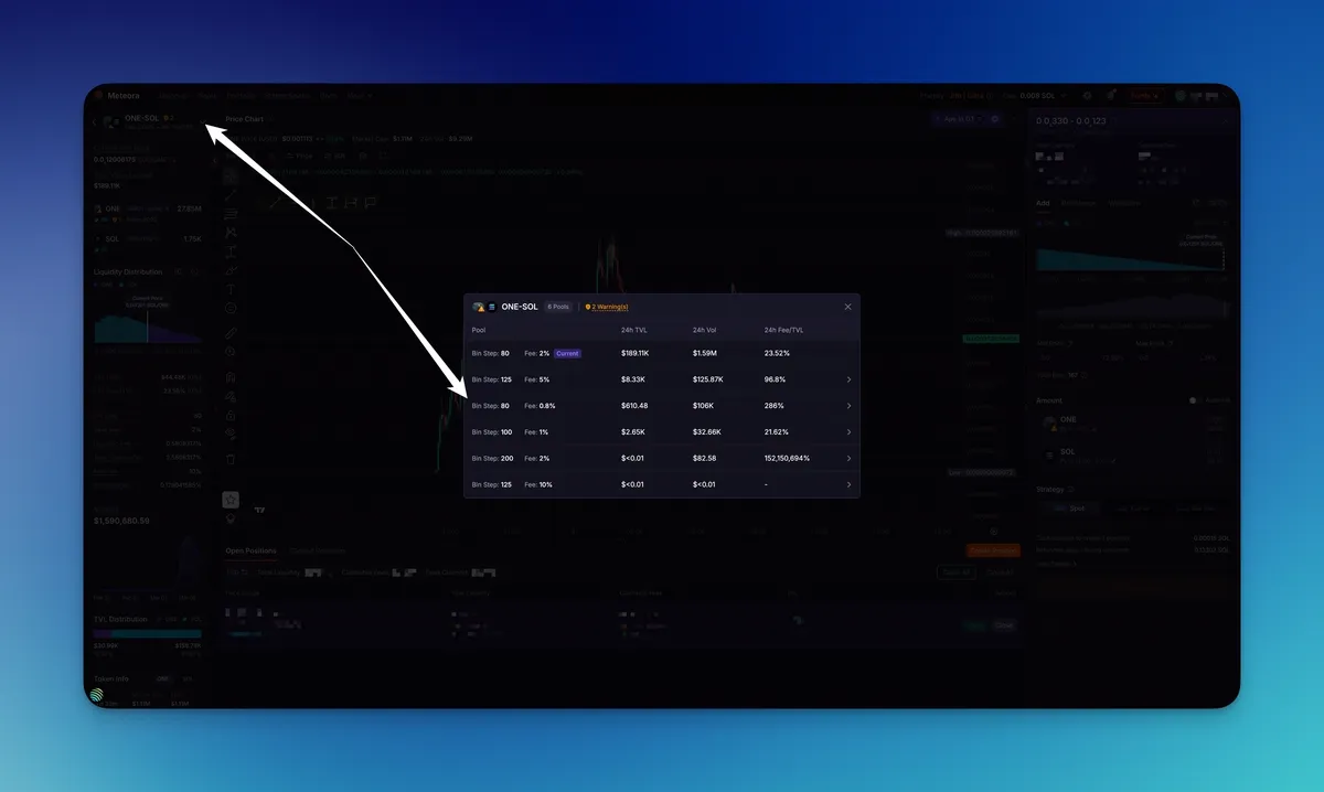
The Bin-Step Switcher: the one I like best. You can now switch between different bin steps (like 50, 80, or 100) right on the pool page. You don't have to go back to the main menu to compare yields anymore.
 MichaelZogot@MichaelZogot
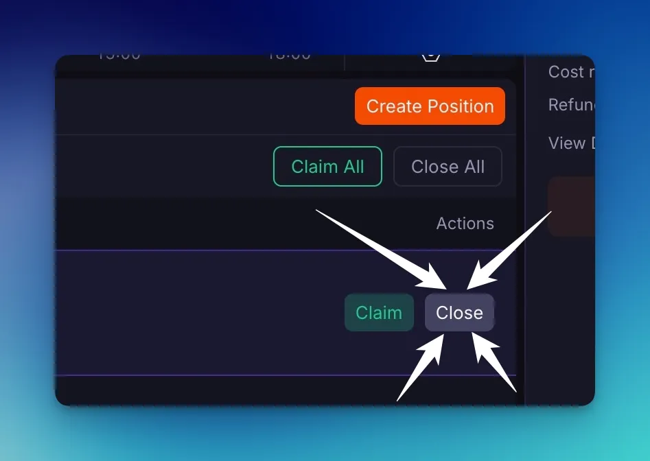
One-Click Close: a "Close" button just for closing a position quickly. Before, closing a position took a lot of clicks and sub-menus. Now you can do it right away.
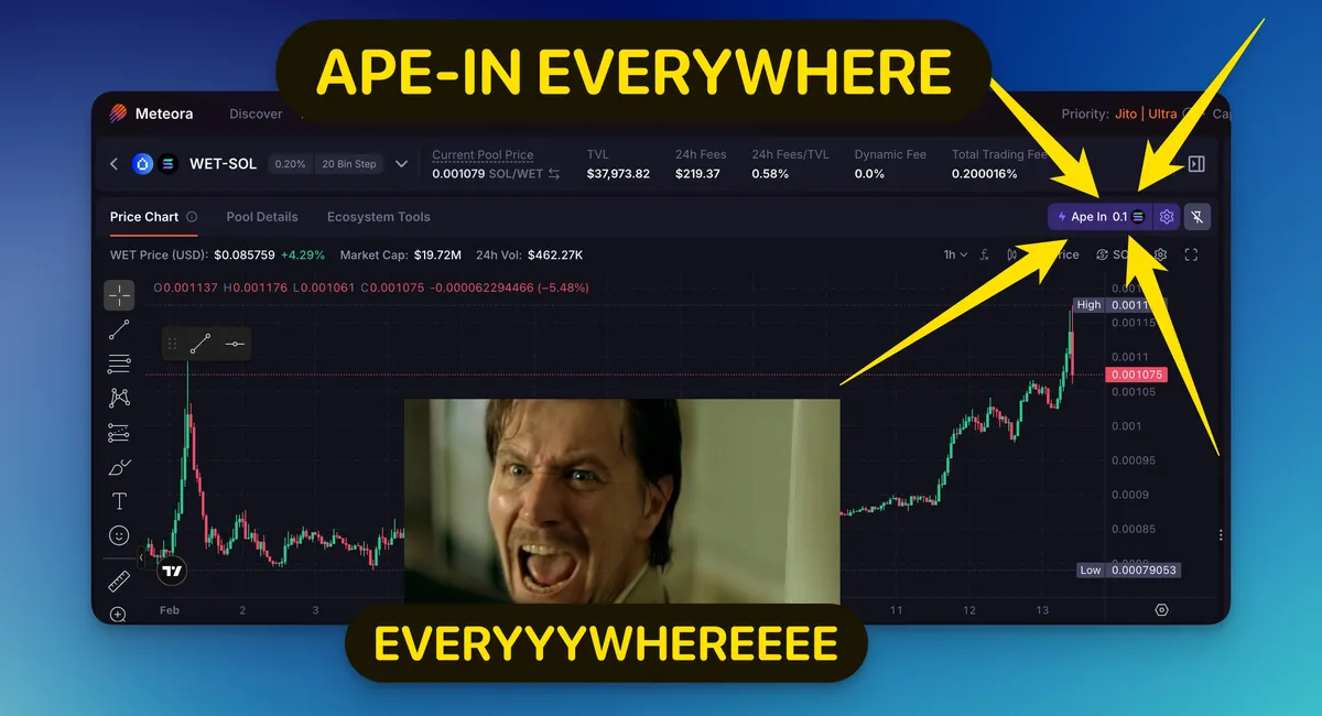
"Ape In" Everywhere: the Ape In feature is now available in all pools, making it easy to enter liquidity with just one click.
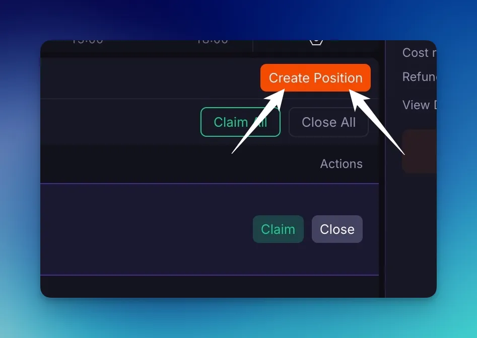
Create Position: a new, permanent "New Position" button is always there. You can use it to start a new strategy as soon as you see an opportunity.
Deep data and visibility
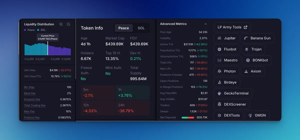
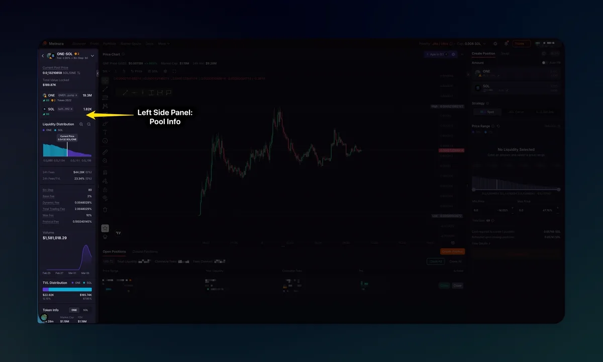
More information about the pool: the info panel now has a lot of new data fields, such as total LPs, swap counts, age of the token, 24-hour volume comparisons, and direct links to community trading tools.
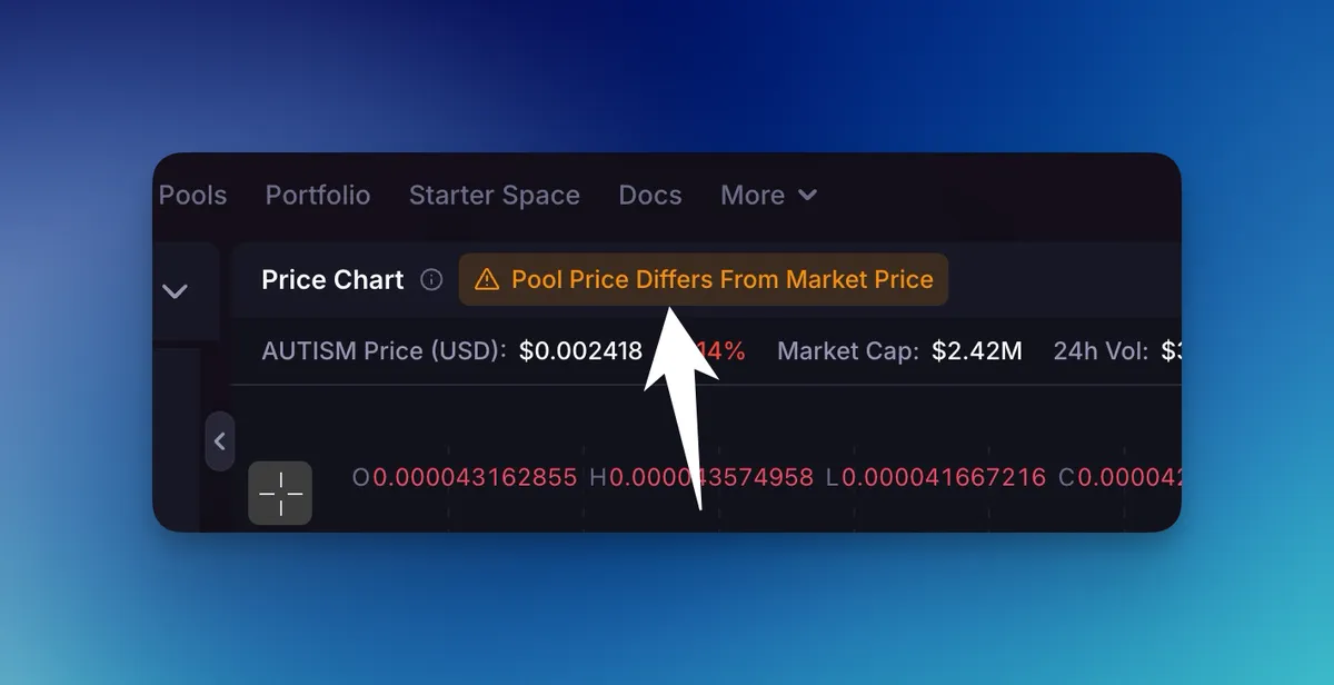
Smart Notifications: pool price alerts, the popups after you close a position, and other notices have been moved so they don't get in the way of the charts or position controls.
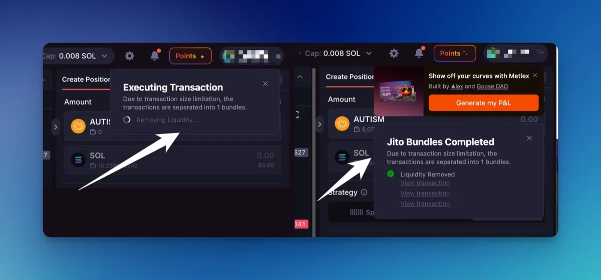
Price that you can click on: you can now interact with the pool price of open positions, which lets you set your ranges on the price chart more quickly and accurately.
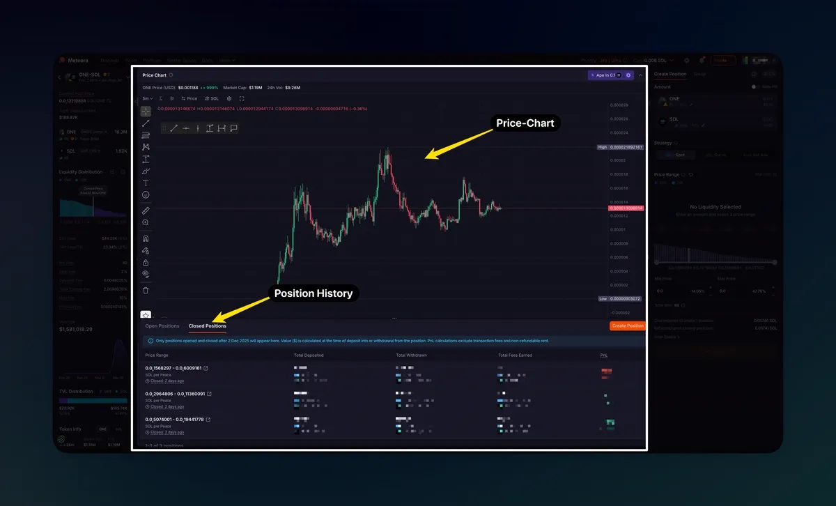
MichaelZogot@MichaelZogotIntegrated Price Chart & Position History: you can now see a big and beautiful Price Chart in the middle of the screen and your Position History right in the main view, which gives you a full view of how you're doing.
Mobile and multi-screen optimized
Mobile Overhaul: the mobile experience is now compact and more powerful. You get a fixed navigation panel that lets you claim, swap, and close with just one tap. This way, you can manage your degen plays on the go without any problems.
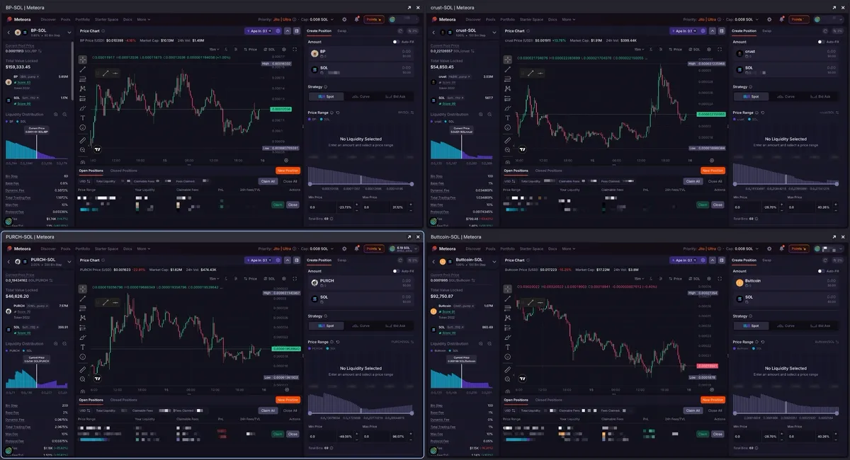
Grid or Multi-screen optimized: the layout is designed to scale for power users running multi-monitor or grid setups.
Watch the walkthrough
I made a full video (it was made with the EDGE version) that shows exactly how I use these features to get the most out of my LP positions. Check it out here if you want to see the new UI in action before you start.
MichaelZogot@MichaelZogotReady to try the new standard? Jump in now: meteora.ag